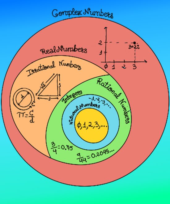
|
 |
 |
|
 |
|
|
|
|
|
|
Informally, a function is increasing if as x gets larger (x-value increases, looking left to right) f(x) or the y-values increases or gets larger. Formally, a function is increasing on the interval (a, b) if ∀ x1, x2 ∈ (a, b) -for any x1 and x2 in the interval-: x1 < x2 ⇒ f (x1) ≤ f(x2).
Similarly, a function is decreasing if as x get larger (x-value increases) f(x) or the y-values decreases. Formally, a function is increasing on the interval (a, b) if ∀ x1, x2 ∈ (a, b): x1 < x2 ⇒ f (x1) ≥ f(x2).
A function is increasing on an interval (a, b) if the first derivative of the function is positive for every point on that interval: f’(x) ≥ 0 ∀ x ∈ (a, b). A function is decreasing on an interval (a, b) if the first derivative of the function is negative for every point on that interval: f’(x) ≤ 0 ∀ x ∈ (a, b). A function is constant on an interval (a, b) if the first derivative of the function is zero for every point on that interval: f’(x) = 0 ∀ x ∈ (a, b).
We define a function in Maxima: f(x) := 8*x^3 +2*x +5; and plot it. The function is monotonically increasing ( ∀ x1, x2: x1 < x2 ⇒ f (x1) ≤ f(x2)) because its derivate is always positive: 24*x2 + 2 (diff(f(x), x); returns the derivative of f(x) with respect to x) ≥ 0. 
Increasing and decreasing functions.
Let’s plot a more complicated function with Maxima and WolframAlpha. f(x):= (x2 -4*x +4)⁄(x - 3); 
Increasing and decreasing functions.
Its derivate is (x -4)(x -2) ⁄ (x - 3)2; Observe that diff(f(x), x); returns the derivate of f(x) with respect to x, ratsimp(%); simplifies the result, and factor(%); factors it. As (x - 3)2 ≥ 0, we only need to worry about the numerator: (x -4)(x -2). Therefore, the critical points are x= 2, 4. We only need to determine the sign of f’(x) over the intervals (-∞, 2), (2, 4) and (4, +∞).
assume(x > 4); tells Maxima to assume that x > 4. is(diff(f(x), x) > 0); returns true, so f’(x) > 0 if x > 4, and thus, f is increasing on (4, +∞).
We could have already reasoned that x > 4 ⇒ x > 2 ⇒ (x -4)(x -2) > 0 ⇒ f’(x) > 0. Another idea is diff(f(x), x); ev(%, x=5); returns 3⁄4 > 0.
forget(x > 4); assume(x > 2, x < 4); is(diff(f(x), x) > 0); returns false, so f’(x) ≤ 0 (we really know that f’(x) < 0 because f’ has only two roots: 2 and 4) if 2 < x < 4, and thus, f is decreasing on (2, 4).
forget(x > 2, x < 4); assume(x < 2); is(diff(f(x), x) > 0); return true, so f’(x) > 0 if x < 2, and thus, f is increasing on (-∞, 2). 
Increasing and decreasing functions.
The maxima and minima (the respective plurals of maximum and minimum) of a function are the largest and smallest value of the function, either within a given range (the local or relative maximum and minimum; you can visualize them as kind of local hills and valleys), or on the entire domain (the global or absolute maximum and minimum).
Formally, a function f defined on a domain D has a global or absolute maximum point at x* if f(x*) ≥ f(x) ∀ x in D. Similarly, the function f has a global or absolute minimum point at x* if f(x*) ≤ f(x) ∀ x in D.
f is said to have a local or relative maximum point at x* if there exists an interval (a, b) containing x* such that f(x*) is the maximum value of f on (a, b) ∩ D: f(x*) ≥ f(x) ∀ x in (a, b) ∩ D. f is said to have a local or relative minimum point at x* if there exists an interval (a, b) containing x* such that f(x*) is the minimum value of f on (a, b) ∩ D: f(x*) ≤ f(x) ∀ x in (a, b) ∩ D.
The critical points of a function f are the x-values, within the domain (D) of f for which f’(x) = 0 or where f’ is undefined. Notice that the sign of f’ must stay constant between two consecutive critical points. If the derivative of a function changes sign around a critical point, the function is said to have a local or relative extremum (maximum or minimum) at that point. If f’ changes sign from positive (increasing function) to negative (decreasing function), the function has a local or relative maximum at that critical point. Similarly, if f’ changes sign from negative to positive, the function has a local or relative minimum. In our example, 2 is a local maximum (f’(x) > 0 in (-∞, 2), f’(x) < 0 in (2, 4)) and 4 is a local minimum (f’(x) < 0 in (2, 4), f’(x) > 0 in (4, +∞))
If a function has a critical point for which f′(c) = 0 and the second derivative is positive (f’’(c) > 0), then c is a local or relative minimum. Analogously, if the function has a critical point for which f′(c) = 0 and the second derivative is negative (f’’(c) < 0), then c is a local or relative maximum. If f’(c)=0 and f’’(c)=0 or if f’’(c) does not exist, then this second test is inconclusive.
diff(f(x),x, 2); will yield the second derivative of f(x). ev(%o71, x = 2); returns -2 (it evaluates the second derivate in x=2) < 0 where %o71 is the output expression of factor(%); (factor the second derivate) so 2 is a local maximum. ev(%o71, x = 4); returns 2 > 0 where %o71 is the output expression of factor(%); (factor the second derivate) so 4 is a local minimum. 
Maximum and Minimum.
An asymptote is a line such that the distance between the graph and the line approaches zero as one or both of the x or y coordinates tends to infinity. In other words, it is a line that the graph approaches (it gets closer and closer, but never actually reach) as it heads or goes to positive or negative infinity.
Asymptotes
Horizontal asymptotes are horizontal lines (parallel to the x-axis) that the graph of the function approaches as x → ±∞. y = c is a horizontal asymptote if the function f(x) becomes arbitrarily close to c as long as x is sufficiently large or formally: 
Horizontal asymptotes
y = 2 is a horizontal asymptote of the graph of the function y = (2x2 -5x +3)⁄(x2 +2x - 3). We use Maxima to plot the function. Maxima can compute limits for a wide range of functions: limit(f(x), x, inf); and limit(f(x), x, -inf); they both return 2.
Vertical asymptotes are vertical lines (perpendicular to the x-axis) of the form x = a (where a is a constant) near which the function grows without bound. The line x = a is a vertical asymptote if: 
Vertical asymptotes
We use the following commands: limit(f(x), x, -3, plus); (this is the limit from the right side of -3) returns -∞ and limit(f(x), x, -3, minus); (this is the limit from the left side of -3) returns ∞ so x = -3 is a vertical asymptote of the graph of the function y = (2x2 -5x +3)⁄(x2 +2x - 3). Notice that our complicated function (2x2 -5x +3)⁄(x2 +2x - 3) could be simplified as (2x -3)⁄(x + 3) (factor(f(x);)
Asymptotes
When a linear asymptote is not parallel to the x- or y-axis, it is called an oblique asymptote. A function f(x) is asymptotic to y = mx + n (m ≠ 0) if: 
Oblique asymptote
(3*x2 -4*x +9)⁄(x - 7) is asymptotic to y = 3**x + 17. x = 7 is a vertical asymptote, too. 
asintota5
Let’s use WolframAlpha and Python to work with asymptotes.
user@pc:~$ python
Python 3.8.6 (default, May 27 2021, 13:28:02)
[GCC 10.2.0] on linux
Type "help", "copyright", "credits" or "license" for more information.
>>> from sympy import * # SymPy is a Python library for symbolic mathematics.
>>> from sympy.plotting import plot # This class permits the plotting of sympy expressions using numerous backends (matplotlib, textplot, pyglet, etc.)
>>> x = symbols('x') # SymPy variables are objects of Symbols class
>>> expr = (3*x**2-4*x+9)/(x-7) # Define our function as expr
>>> limit(expr/x, x, oo) # Limits are easy to use in Sympy. We compute the limit of expr/x when x increases without bound (∞)
3 # m = 3
>>> limit(expr-3*x, x, oo)
17 # n = 17. (3*x2 -4x +9)⁄(x - 7) is asymptotic to y = 3*x + 17.
>>> limit(expr, x, 7, '+') # Calculate the limit from the right side of 7
oo
>>> limit(expr, x, 7, '-') # Calculate the limit from the left side of 7
-oo # x = 7 is a vertical asymptote
>>> p1 = plot(expr, (x, -1, 15), ylim=[-150,150], show=False) # We plot our function ...
>>> p2 = plot(3*x+17, (x, -1, 15), ylim=[-150,150], line_color="#ff0000", show = False) # and the oblique asymptote, too
>>> p1.append(p2[0])
>>> p1.show()

A function is called convex if the line segment or chord between any two points A1, A2, on the graph of the function lies above the graph between the two points (the midpoint B lies above the corresponding point A0 of the graph of the function). f is concave if -f is convex.
Formally, f is convex on an interval [a, b] if ∀ x1, x2 ∈ [a, b], 0 < θ <1, the following inequality holds: f(θa + (1-θ)b) ≤ θf(a) + (1-θ)f(b) or
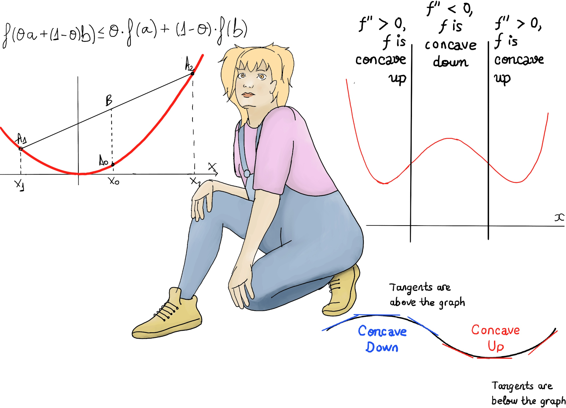
Suppose that f is a twice differentiable function defined on an interval [a, b]. If f’’(x) ≥ 0 for every x in the interval, then the function f is convex on this interval. If f’’(x) ≤ 0 for every x in the interval, then the function f is concave on this interval.
Inflection points are where the function changes concavity (from being concave to convex or vice versa). So the second derivative must be equal to zero to be an inflection point. However, we have to make sure that the concavity actually changes at that point.
Let’s plot x4 -4x2 with Maxima. Firstly, we define the function: f(x):= x^4 -4*x^2; Secondly, we plot it: wxplot2d([f(x)], [x,-3,3], [y,-5,5]); Then, we ask Maxima for the second derivate (diff(f(x), x, 2)); returns 12*x2 -8, plot it (wxplot2d([12*x^2-8], [x,-3,3]);) and calculate its roots (solve(diff(f(x), x, 2)); returns ± sqrt(2⁄3)).

assume(x> sqrt(2/3)); is(diff(f(x), x, 2) > 0) returns true. f’’(x) > 0, f is convex in (√2⁄3, ∞).
ev(%o25, x = 0); (%o25 is the output expression of diff(f(x), x, 2);) return
-8 < 0. f’’(x) < 0, f is concave in [-√2⁄3, √2⁄3].
ev(%o25, x = -2); returns 40. f’’(x) > 0, f is convex in (-∞, -√2⁄3) and √2⁄3 and -√2⁄3 are two inflection points because concavity actually changes on them.
Let’s plot another function (5*x3 +2*x2 -3*x) with Google and Python (SymPy).

user@pc:~$ python
Python 3.8.6 (default, May 27 2021, 13:28:02)
[GCC 10.2.0] on linux
Type "help", "copyright", "credits" or "license" for more information.
>>> from sympy import * # SymPy is a Python library for symbolic mathematics.
>>> from sympy.plotting import plot  # This class permits the plotting of sympy expressions using numerous backends (matplotlib, textplot, pyglet, etc.)
>>> x = symbols('x') # SymPy variables are objects of Symbols class
>>> expr = 5*x**3 +2*x**2 -3*x # Define our function as expr = 5*x3 +2*x2 -3x
>>> diff(expr, x, 2) # Calculate the second derivative with respect to x
2*(15*x + 2) # f'(x) = 15*x2 +4x -3, f''(x) = 30x + 4
>>> deriv = diff(expr, x, 2)
>>> solve(deriv)
[-2/15] # -2⁄15 is a plausible inflection point. We need to study the sign of f'' in  (-∞, -2⁄15), (-2⁄15, +∞)
>>> deriv.subs(x, 0) # subs evaluates the expression "deriv" (f'') at x = 0.
4 # f''(0) > 0, f is convex in (-2⁄15, +∞)
>>> deriv.subs(x, -1)
-26 # f''(-1) < 0, f is concave in (-∞, -2⁄15) and -2⁄15 is an inflection point because concavity actually changes on it.
>>> plot(expr, (x, -2, 2), ylim=[-2, 2]) # We plot our function
Let’s try to visualize Covid data with gnuplot. I went to kaggle.com and downloaded a dataset with this format: Country/Region,Confirmed,Deaths,Recovered,Active,New cases,New deaths,New recovered,Deaths/100 Cases,Recovered / 100 Cases,Deaths / 100 Recovered,Confirmed last week,1 week change,1 week % increase,WHO Region Afghanistan,36263,1269,25198,9796,106,10,18,3.5,69.49,5.04,35526,737,2.07,Eastern Mediterranean Albania,4880,144,2745,1991,117,6,63,2.95,56.25,5.25,4171,709,17.0,Europe …
First, we are going to clean up our dataset: cut -d, -f “1 2 3” country_wise_latest.csv > myCovid.csv . The cut command is an utility program that allows you to filter data from a text file. Cutting by column is super easy, you first need to decide a delimiter, default is tab (we are going to override it by providing the “-d” option as -d,), then you need to specify column numbers with -f option (‘1 2 3’, Country, Confirmed, and Deaths).
Country/Region,Confirmed,Deaths France,220352,30212 US,4290259,148011 India,1480073,33408 Italy,246286,35112 Russia,816680,13334 Spain,272421,28432 UK,301708,45844
Next, we are going to plot our data with gnuplot:
set datafile separator ','
# It tells gnuplot that data fields in our input file myCovid.csv are separated by ',' rather than by whitespace
set title "Covid visualization" font "Helvetica,18"
# It produces a plot title that is centered at the top of the plot.
set key autotitle columnheader
# It causes the first entry in each column of input data (Confirmed, Deaths) to be interpreted as a text string and used as a title for the corresponding plot.
plot for [i=2:3] "myCovid.csv" using i:xticlabels(1) ps 2 pt 7
Plot using the 2nd and 3rd column; xticlabels(1) means that the 1st column of the input data file is to be used to label x-axis tic marks. Besides, ps 2 will generate points of twice the normal size and pt 7 indicates to use circular points.
We can also join our data points with lines:
set style line 1 linecolor rgb '#ff0000' linetype 1 linewidth 2 pointtype 7 pointsize 2
plot for [i=2:3] "myCovid.csv" using i:xtic(1) with linespoints linestyle 1

Another common task is to create a histogram with gnuplot:
set style data histogram
# Set the style to histograms
set style fill solid border -1 plot for [i=2:3] "myCovid.csv" using i:xtic(1)
# Plot using the 2nd and 3rd column; xticlabels(1) means that the 1st column of the input data file is to be used to label x-axis tic marks.

Besides, the individual boxes or rectangles you see on the spreadsheet are called cells. Each cell has a unique name defined by its column and row.


We can see clearly that the USA and India have become the worst-hit countries by the pandemic.
Plotly is an open-source, interactive data visualization library for Python. Plotly Express is the easy-to-use, high-level interface to Plotly.
user@pc:~$ python
Python 3.8.6 (default, May 27 2021, 13:28:02)
[GCC 10.2.0] on linux
Type "help", "copyright", "credits" or "license" for more information.
>>>import plotly.express as px # Requirements: pip install pandas plotly
>>>df = px.data.gapminder() # We are going to load the built-in gapminder dataset from plotly
>>> df.query("country=='Spain'") # We can filter data by country
     country continent year lifeExp   pop   gdpPercap  iso_alpha iso_num
1416  Spain Europe  1952   64.940  28549870 3834.034742 ESP      724
1417  Spain Europe  1957   66.660  29841614 4564.802410 ESP      724
1418  Spain Europe  1962   69.690  31158061 5693.843879 ESP      724
1419  Spain Europe  1967   71.440  32850275 7993.512294 ESP      724
1420  Spain Europe  1972   73.060  34513161 10638.751310 ESP     724
1421  Spain Europe  1977   74.390  36439000 13236.921170 ESP     724
1422  Spain Europe  1982   76.300  37983310 13926.169970 ESP     724
1423  Spain Europe  1987   76.900  38880702 15764.983130 ESP     724
1424  Spain Europe  1992   77.570  39549438 18603.064520 ESP     724
1425  Spain Europe  1997   78.770  39855442 20445.298960 ESP     724
1426  Spain Europe  2002   79.780  40152517 24835.471660 ESP     724
1427  Spain Europe  2007   80.941  40448191 28821.063700 ESP     724
>>> spain_data = df.query("country=='Spain'")
>>> fig = px.bar(spain_data, x='year', y='pop', color='lifeExp', labels={'pop': 'Population of Spain'}, height=400, template='plotly_dark')
Create a bar chart showing the population of Spain (spain_data, y=‘pop’, pop is short for population) over 57 years (x=‘year’, 1950-2007, the gapminder dataset has been updated to 2007) and using color gradient for lifeExp (color=‘lifeExp’)
>>> fig.show()
As you can see in the graph below, Spain has seen an increase in both population (28.5 - 40.4) and life expectancy (64.9-80.9) in the last half century.

>>> fig = px.scatter(df.query("year==2007"), x="gdpPercap", y="lifeExp", size="pop" color="continent", hover_name="country", log_x=True, size_max=60)
Let’s plot a bubble chart (a type of scatter plot in which a third dimension of the data is shown through the size of the bubbles):
>>> fig.show()
Obviously, people in rich countries live longer than people in poor countries. There’s a strong relationship between GDP and life expectancy.

Let’s create a choropleth map using Plotly. A choropleth map displays divided geographical areas or regions that are coloured or patterned in relation or proportion to a statistical variable.
>>> fig = px.choropleth(df, locations='iso_alpha', # Countries as defined in the Natural Earth dataset. Natural Earth Vector draws boundaries of countries according to defacto status.
      color='lifeExp', # lifeExp is short for life expectancy, a column of gapminder.
      hover_name='country', # When hovering over the country, a square will show up with the name of the country, year, life expectancy and location as a three-letter ISO country code.
      animation_frame='year', # It allows us to animate and add the play and stop button under the map.
      color_continuous_scale=px.colors.sequential.Plasma, # We can set a color scheme.
      projection='natural earth') # Geo maps are drawn according to a given map projection (e.g., 'equirectangular', 'mercator', 'orthographic', 'natural earth', etc.) that flattens the Earth's surface into a 2-dimensional space.
>>> fig.show()

Let’s plot e-(x2 + y2) in WolframAlpha (plot e^-(x^2+y^2) x=-3..3, y=-3..3) and Google. It is as simple as typing the function into your browser!

We are going to ask Maxima for a 3d-plot and contour lines of the two variables function sin(x2)+cos(y2):
wxplot3d(f(x), [x,-%e,%e], [y,-%e,%e]);
# Plots sin(x2)+cos(y2) within the ranges [-e, e] and [-e, e].
wxcontour_plot(f(x), [x,-%e,%e], [y,-%e,%e]);
# Plots contour lines of sin(x2) +cos(y2) within the ranges [-e, e] and [-e, e].

Let’s ask Maxima to create a surface plot and projected contour plot under it:
mypreamble : "set contour; set cntrparam levels 20; unset key";
# Define a preamble with some commands: set contour (enable contour drawing for surfaces); set cntrparam levels 20 (set the number of contour levels to 20), unset key (ask Maxima for the plot to be drawn with no visible key).

wxplot3d(x*sin(y)+y*sin(x), [x, -6, 6], [y, -6, 6], [gnuplot_preamble, mypreamble]);
# Plots x*sin(y)+y*sin(y) within the ranges [-6, 6] and [-6, 6], and using my predefined preamble.

3D Plotting
user@pc:~$ gnuplot
	G N U P L O T
	Version 5.2 patchlevel 8    last modified 2019-12-01
gnuplot> set hidden3d # The set hidden3d command enables hidden line removal for surface plotting.
gnuplot> set xlabel 'x' # Set the label for the x-axis.
gnuplot> set xlabel 'y' # Set the label for the y-axis.
gnuplot> set title "exp (-1/(x**2 + y**2)"
gnuplot> set isosamples 80 # Set a higher sampling rate. It will produce more accurate plots, but will take longer.
gnuplot> set contour # It enables contour drawing for surfaces.
gnuplot> splot [-3:3] [-3:3] exp(-1 /(x**2 + y**2)) # Plot e-1⁄(x2 + y2) withing the ranges [-3:3] and [-3:3].

user@pc:~$ gnuplot G N U P L O T Version 5.2 patchlevel 8 last modified 2019-12-01
gnuplot> set parametric
# It changes the meaning of splot from normal functions to parametric functions.
gnuplot> set xlabel 'x' # Set the label for the x-axis.
gnuplot> set xlabel 'y' # Set the label for the y-axis.
gnuplot> set ticslevel 0 # It causes the surface to be drawn from the base.
gnuplot> set isosamples 36, 18 # Set a higher sampling rate. It will produce more accurate plots, but will take longer.
gnuplot> set size 0.60, 1.0 # It scales the plot itself relative to the size of the canvas.
gnuplot> splot cos(u)*cos(v), sin(u)*cos(v), sin(v) # Plot cos(u)*cos(v), sin(u)*cos(v), sin(v).


JustToThePoint Copyright © 2011 - 2024 Anawim. ALL RIGHTS RESERVED. Bilingual e-books, articles, and videos to help your child and your entire family succeed, develop a healthy lifestyle, and have a lot of fun. Social Issues, Join us.
This website uses cookies to improve your navigation experience.
By continuing, you are consenting to our use of cookies, in accordance with our Cookies Policy and Website Terms and Conditions of use.