
|
 |
 |
|
|
|
|
As long as algebra is taught in school, there will be prayer in school, Cokie Roberts

Jupyter Lab is a powerful, web-based development environment (IDE) for working with notebooks, code, and data. It provides a flexible and customizable interface for data scientists, researchers, and educators to work with Jupyter Notebooks, text files, terminals, and other tools side-by-side. In this section, we will cover the basics of using Jupyter Lab.
Prerequisites: Ensure Python (version 3.8 or later) is installed.
To start using Jupyter Lab, you need to have it installed on your system. You can install Jupyter Lab using pip, which is the Python package manager.
Open a terminal, install Jupyter Lab (pip install jupyterlab or python -m pip install jupyterlab), and start Jupyter Lab from the folder you want as your working directory by running: jupyter lab. This starts a local server (JupyterLab) and opens your browser at http://localhost:8888. Stop it with Ctrl + C in the terminal.
The Jupyter Lab interface is divided into several sections:
Notebooks are the core component of Jupyter Lab. It consist of cells where you can write code or text. There are two main types of cells: code cells and Markdown cells.
Code Cells: Execute or run Python code by pressing Shift + Enter (advance) or Ctrl + Enter (stay). Use for experimentation and seeing immediate results.
Markdown Cells: Document your work using Markdown formatting. Switch type with the toolbar or M (Markdown)/Y (Code) in command mode.
Magic Commands: Magic commands are special commands in Jupyter that start with the “%”, “%%”, or “!” symbols. They provide additional functionality, such as timing code execution or running shell commands directly within the notebook.
%timeit x = [i for i in range(1000000)] # Time how long it takes to create a list of 1 million elements (benchmark)
%pwd # Show current working directory
%ls # List files in current directory (use !dir on Windows)
%cd .. # Change directory
!echo "Hello from the shell" # Run shell commands directly
# Running other languages
%%html # HTML rendering in a cell
<h2>This is rendered as HTML </h2>
Output: 47.7 ms ± 819 μs per loop (mean ± std. dev. of 7 runs, 10 loops each)
Directory of C:\Users\Owner\Documents\myPython […]
Create a new notebook: To create a new notebook, navigate to File, New in the menu bar, select Notebook, then choose a Python kernel to start a new notebook. A new notebook opens with a default code cell. Switch to Markdown mode to add documentation.
Kernels are the execution engines that run your code in JupyterLab. Each kernel corresponds to a specific programming language or environment (e.g., Python 3.11, R, Julia), and you can install additional kernels or switch between them depending on your project’s needs. Switching kernel: Top‑right corner of the JupyterLab interface, click the kernel name dropdown, and select a different kernel from the list. Why? You can isolate project dependencies, work with different Python versions or different languages.
Interrupt Kernel to stop the execution of a currently running cell (useful if it’s stuck in an infinite loop or taking too long). Click the Stop (■) button in the notebook toolbar or use Kernel, Interrupt.
Open an existing notebook: To open an existing notebook, navigate to the file browser in the left sidebar and double click an .ipynb on the notebook file.
Edit a notebook: You can edit a notebook by adding or modifying cells, which can contain code, text, images, and other media.
Run a cell: To run a cell, click on the Toolbar’s “Run” button or press Shift + Enter.
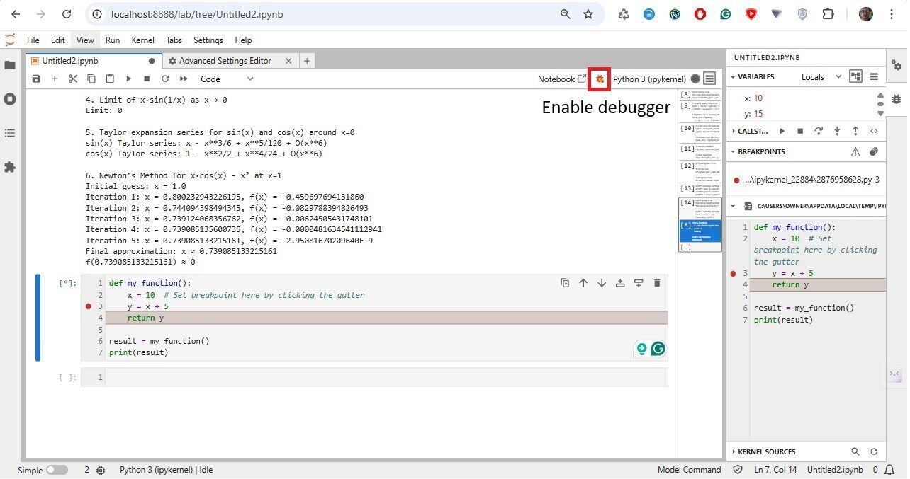
Debugging. (i) Ensure you have a debug-capable kernel. Install if needed: pip install ipykernel>=6.0. (ii) Enable Debugger: In your notebook, click the bug icon (top-right of the notebook panel) to activate debug mode. (iii) Set Breakpoint: In the code cell, click the gutter (left of the line number) next to the line where you want to pause. (iv) Run the Cell; step/continue, inspect variables, call stack, etc.
In JupyterLab, line numbers in code cells are optional and often turned off by default. Go to Settings, Setting Editor, JSON Settings Editor in JupyterLab. In the User Preferences panel, add:
"codeCellConfig": {
"lineNumbers": true
}
Terminals provide a way to interact with your system’s command-line interface. Here’s how to work with them:
Terminal.Jupyter Lab provides various options for customization:
Here are some tips and best practices to help you get the most out of Jupyter Lab:
project/
├── data/
│ └── iris.csv
├── notebooks/
│ └── analysis.ipynb
└── README.md
from IPython.display import Markdown, HTML
Markdown("""
# Hello from Markdown!
- This is a list
- **Bold** and *italic* work too.
""")
# Or HTML
HTML("<h2 style='color:green;'>Styled HTML Output</rh2>")
# Use ! to run terminal commands:
# List files in current directory
!ls (!dir if using Windows)
# Check Python version
!python --version
# Install a package (if needed)
!pip install seaborn
Systems of linear equations are foundational in algebra. In JupyterLab, NumPy and SymPy handle these effectively.
# Import the NumPy library for numerical operations
import numpy as np
# This code sets up a system of equations represented by the matrix A and vector b
# Define the coefficient matrix A
A = np.array([[2, -3, 1],
[1, -1, 2],
[3, 1, -1]])
# Define the constant vector b
b = np.array([-1, -3, 9])
# Solve the system of equations Ax = b
# It uses np.linalg.solve() to find the values of the variables that satisfy the equations.
solution = np.linalg.solve(A, b)
# Print the solution to the console
print("Solution:", solution) # Output: [ 2. 1. -2.]
# Import the NumPy library for numerical operations
import numpy as np
# Define the coefficient matrix A
A = np.array([[1, -1, 4],
[3, 0, 1],
[-1, 1, -4]])
# Define the constant vector b
b = np.array([-5, 0, 20])
# Try to solve the system of equations Ax = b
try:
solution = np.linalg.solve(A, b)
except np.linalg.LinAlgError as e:
# Handle any linear algebra errors, such as singular matrix
print("Error:", e) # Output may indicate a singular matrix
Output: Error: Singular matrix
A singular matrix is a square matrix that cannot be inverted because its determinant is zero.
# Import the necessary libraries for plotting and numerical operations
import matplotlib.pyplot as plt
import numpy as np
# Generate data: create an array of 100 points evenly spaced between 0 and 10 for x
x = np.linspace(0, 10, 100)
# Calculate the sine of each x value to get corresponding y values
y = np.sin(x)
# Create a new figure with specified size for better visualization
plt.figure(figsize=(8, 5))
# Plot the sine wave with a label and color
plt.plot(x, y, label='sin(x)', color='blue')
# Set the title of the plot
plt.title('Sine Wave')
# Label the x-axis
plt.xlabel('x')
# Label the y-axis
plt.ylabel('sin(x)')
# Add a legend to the plot
plt.legend()
# Enable the grid for better readability
plt.grid(True)
# Display the plot
plt.show(
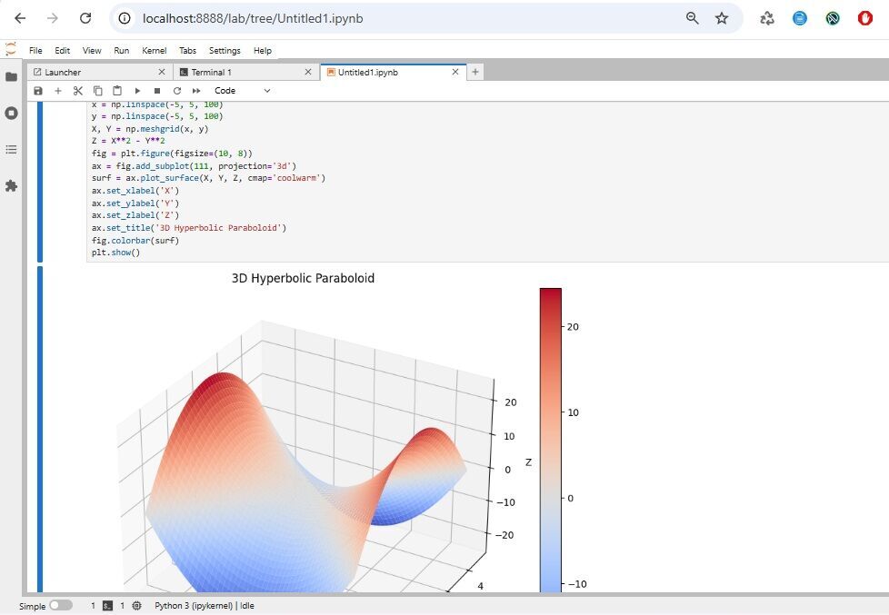
This code generates a 3D surface plot of a hyperbolic paraboloid defined by the equation z = x² - y²
# Import the necessary libraries for numerical operations and plotting
import numpy as np
import matplotlib.pyplot as plt
# Create an array of 100 points evenly spaced between -5 and 5 for the x-axis
x = np.linspace(-5, 5, 100)
# Create an array of 100 points evenly spaced between -5 and 5 for the y-axis
y = np.linspace(-5, 5, 100)
# Create a meshgrid from the x and y arrays for 3D plotting
X, Y = np.meshgrid(x, y)
# Define Z as a hyperbolic paraboloid function
Z = X**2 - Y**2
# Create a new figure with specified size for better visualization
fig = plt.figure(figsize=(10, 8))
# Add a 3D subplot to the figure
ax = fig.add_subplot(111, projection='3d')
# Plot the surface of the hyperbolic paraboloid with a colormap
surf = ax.plot_surface(X, Y, Z, cmap='coolwarm')
# Label the x-axis
ax.set_xlabel('X')
# Label the y-axis
ax.set_ylabel('Y')
# Label the z-axis
ax.set_zlabel('Z')
# Set the title of the plot
ax.set_title('3D Hyperbolic Paraboloid')
# Add a color bar to indicate the scale of Z values
fig.colorbar(surf)
# Display the plot
plt.show()
SciPy is like NumPy’s brainy older sibling —it takes the powerful array-handling capabilities of NumPy and layers on a rich set of scientific and technical computing tools.
SciPy handles correlations and regressions. The Pearson correlation coefficient, often denoted as r, is a statistical measure that quantifies the strength and direction of a linear relationship between two continuous variables.
Mathematically, it’s defined as: r = $\frac{\text{Cov}(X, Y)}{\sigma_X \sigma_Y}$ where:
Interpretation: r = 1, perfect positive linear correlation; r = -1, perfect negative linear correlation; r = 0, no linear correlation; 0 < r < 1, positive correlation (weak to strong); -1 < r < 0, negative correlation (weak to strong).
We are going to analyze the relationship between smoking habits and lung cancer using Python in JupyterLab.
# Import necessary libraries for data analysis and visualization
import numpy as np
from scipy.stats import linregress, pearsonr
import matplotlib.pyplot as plt
# Define smoking habits (categorical)
# x represents smoking habits: 0 = No use, 1 = Light use, 2 = Heavy use
habits = ['No use', 'Light use', 'Heavy use']
x_numeric = np.array([0, 1, 2]) # Numerical mapping
# y represents lung cancer incidence rates per 100,000 people
# Simulated cancer incidence rates (fictional data) per 100,000 people
cancer_rates = np.array([
[12, 14, 11, 13, 10], # No use group
[18, 22, 19, 21, 20], # Light use group
[45, 52, 48, 55, 50] # Heavy use group
])
# Prepare data for regression analysis
# Create an array for x values by repeating the numerical mapping for each data point in cancer_rates.
# It converts categorical smoking habits into numerical values for analysis.
x_plot = np.repeat(x_numeric, len(cancer_rates[0]))
# Output: x_plot = [0, 0, 0, 0, 0, 1, 1, 1, 1, 1, 2, 2, 2, 2, 2]
When you want to plot or run regression, you need one x-value per y-value. Right now, x_numeric has only 3 values (one per category), but cancer_rates has 15 values (5 per category). We need to repeat each category code so it matches the number of data points in that category.
np.repeat(array, repeats) takes each element of array and repeats it ‘repeats’ times in a row, e.g., np.repeat([0, 1, 2], 5) returns array([0, 0, 0, 0, 0, 1, 1, 1, 1, 1, 2, 2, 2, 2, 2])
y_plot = np.concatenate(cancer_rates)
# np.concatenate(cancer_rates) flattens the 3×5 array into one long 1D array
# Output: array([12, 14, 11, 13, 10, 18, 22, 19, 21, 20, 45, 52, 48, 55, 50])
# It calculates the average cancer incidence rate for each smoking group, providing insight into the data.
mean_rates = [np.mean(group) for group in cancer_rates]
# Pearson correlation
r, p_value = pearsonr(x_plot, y_plot)
# Linear regression
slope, intercept, r_value, p_val, std_err = linregress(x_plot, y_plot)
Linear regression. It’s a method for finding the straight line that best fits a set of data points. The idea is to model the relationship between two variables, x and y, using an equation:y = m x + b where m is the slope (the rate of change between x and y) and b is the intercept (where the line crosses the y-axis).
If you plot all your (x, y) data on a graph, the line won’t go through every point perfectly. Each point has a residual — the vertical distance between the actual y and the predicted $\hat{y}$ from the line. Least squares says: Find the line where the sum of the squares of all these residuals is as small as possible.
# Set the size of the figure for the plot, making it wider and taller for better visibility.
plt.figure(figsize=(10, 6))
# Plot the raw data as scatter points, representing each cancer incidence rate associated with smoking habits.
# 'alpha' controls the transparency of the points for better visualization
plt.scatter(x_plot, y_plot, alpha=0.7, label='Individual Data Points')
# Plot the mean cancer incidence rates for each smoking group, using larger red markers for emphasis.
# The 'color' sets the point color, 's' controls the size of the markers
plt.scatter(x_numeric, mean_rates, color='red', s=100, label='Group Means')
# Prepare data for the regression line
# 'x_reg' generates a series of evenly spaced values between -0.5 and 2.5. This is used to calculate y values for the regression line.
x_reg = np.linspace(-0.5, 2.5, 100)
# Plot the regression line using the equation: y = mx + b
# It adds a dashed red line representing the fitted regression line based on the slope and intercept.
plt.plot(x_reg, intercept + slope*x_reg, 'r--', label='Regression Line')
# Label the x-axis
plt.xlabel('Smoking Habits (0=No use, 1=Light, 2=Heavy)')
# Label the y-axis
plt.ylabel('Cancer Incidence per 100,000')
# Set the title of the plot
plt.title('Smoking Habits vs Lung Cancer Incidence')
# Add a legend to the plot to differentiate data points and means
plt.legend()
# Enable grid lines for better readability of the plot
plt.grid(True)
# Customize x-ticks to show descriptive labels for smoking habits.
plt.xticks([0, 1, 2], habits)
# Renders the plot in the output cell.
plt.show()
# Print the results of the analysis
print(f"Correlation coefficient: {r:.3f}") # Displays the correlation value formatted to three decimal places
print(f"P-value: {p_value:.4f}") # Displays the p-value formatted to four decimal places
print(f"Regression equation: y = {slope:.1f}x + {intercept:.1f}") # Shows the linear regression equation
print(f"R-squared: {r_value**2:.3f}") # Displays the R-squared value, indicating the goodness of fit
Output:
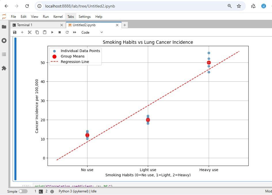
Correlation coefficient: 0.939
P-value: 0.0000
Regression equation: y = 19.0x + 8.3
R-squared: 0.882
This analysis shows a strong positive correlation between smoking intensity and lung cancer incidence in our sample data.
For exact algebraic manipulation, SymPy is a Python library for symbolic mathematics. It aims to become a full-featured computer algebra system (CAS) while keeping the code as simple as possible in order to be comprehensible and easily extensible.
# Import necessary functions and classes from the SymPy library for symbolic mathematics
import sympy as sp
from sympy import symbols, diff, integrate, limit, sin, cos, sqrt, series
from sympy.abc import x, t # Conveniently import symbols x and t
# 1. Derivative and integral of f = x³ + 2x² - 5x
print("1. Derivative and integral of f = x³ + 2x² - 5x")
f = x**3 + 2*x**2 - 5*x # Define the polynomial function f
f_derivative = diff(f, x) # Calculate the derivative of f with respect to x
f_integral = integrate(f, x) # Calculate the integral of f with respect to x
print(f"Derivative: {f_derivative}") # Display the derivative
print(f"Integral: {f_integral} + C\n") # Display the integral, adding + C for the constant of integration
# 2. Derivative of √(3t - 4)
print("2. Derivative of √(3t - 4)")
g = sqrt(3*t - 4) # Define the function g
g_derivative = diff(g, t) # Calculate the derivative of g with respect to t
print(f"Derivative: {g_derivative}\n") # Display the derivative
# 3. Integral of 6x⁵ - 18x² + 7x
print("3. Integral of 6x⁵ - 18x² + 7x")
h = 6*x**5 - 18*x**2 + 7*x # Define the polynomial function h
h_integral = integrate(h, x) # Calculate the integral of h with respect to x
print(f"Integral: {h_integral} + C\n") # Display the integral, adding + C
# 4. Limit of x·sin(1/x) as x → 0
print("4. Limit of x·sin(1/x) as x → 0")
limit_expr = x * sin(1/x) # Define the expression for the limit
limit_result = limit(limit_expr, x, 0) # Calculate the limit as x approaches 0
print(f"Limit: {limit_result}\n") # Display the limit result
# 5. Taylor expansion series for sin(x) and cos(x) around x = 0
print("5. Taylor expansion series for sin(x) and cos(x) around x = 0")
sin_series = series(sin(x), x, 0, 6) # Calculate the Taylor series for sin(x) up to the x^6 term
cos_series = series(cos(x), x, 0, 6) # Calculate the Taylor series for cos(x) up to the x^6 term
print(f"sin(x) Taylor series: {sin_series}") # Display the Taylor series for sin(x)
print(f"cos(x) Taylor series: {cos_series}\n") # Display the Taylor series for cos(x)
Output:
Derivative and integral of f = x³ + 2x² - 5x
Derivative: 3*x**2 + 4*x - 5
Integral: x**4/4 + 2*x**3/3 - 5*x**2/2 + C
Derivative of √(3t - 4)
Derivative: 3/(2*sqrt(3*t - 4))
Integral of 6x⁵ - 18x² + 7x
Integral: x**6 - 6*x**3 + 7*x**2/2 + C
Limit of x·sin(1/x) as x → 0
Limit: 0
Taylor expansion series for sin(x) and cos(x) around x = 0
sin(x) Taylor series: x - x**3/6 + x**5/120 + O(x**6)
cos(x) Taylor series: 1 - x**2/2 + x**4/24 + O(x**6)
%matplotlib inline (classic Notebook) or ensure the cell finishes executing and call plt.show().$···$ or $$···$$.
JustToThePoint Copyright © 2011 - 2026 Anawim. ALL RIGHTS RESERVED. Bilingual e-books, articles, and videos to help your child and your entire family succeed, develop a healthy lifestyle, and have a lot of fun. Social Issues, Join us.
This website uses cookies to improve your navigation experience.
By continuing, you are consenting to our use of cookies, in accordance with our Cookies Policy and Website Terms and Conditions of use.